UTA Web Components

Sitecore Templates
Sitecore templates serve as the foundation that the components are built on. Different templates allow for different layouts of your page, making anything possible.
New Look Components
The 'New Look' components are components with a refreshed style. Do not use these components on a page with any 'Classic Look' components.
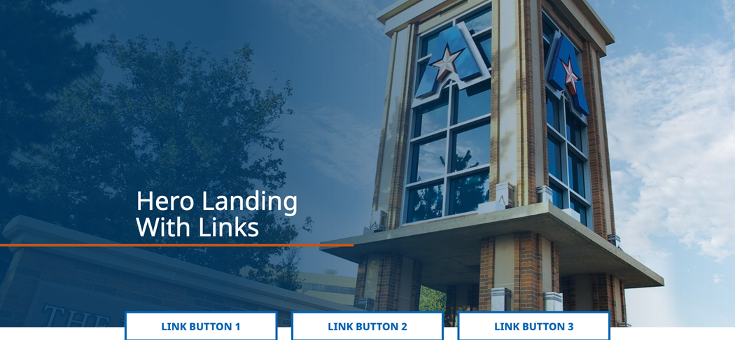
Hero Landing with Links
The Hero Landing with Links allows you to place up to three links on a Hero Landing.
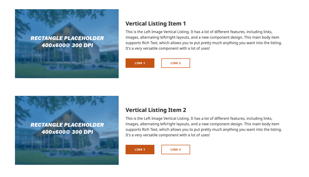
Left Image Vertical Listing
The Left Image Vertical Listing is a great way to add a lot of information to a page efficiently.

Right Grid Content Block with Links
The Right Grid Content Block with Links lets you add five links to a page, four of which have images.
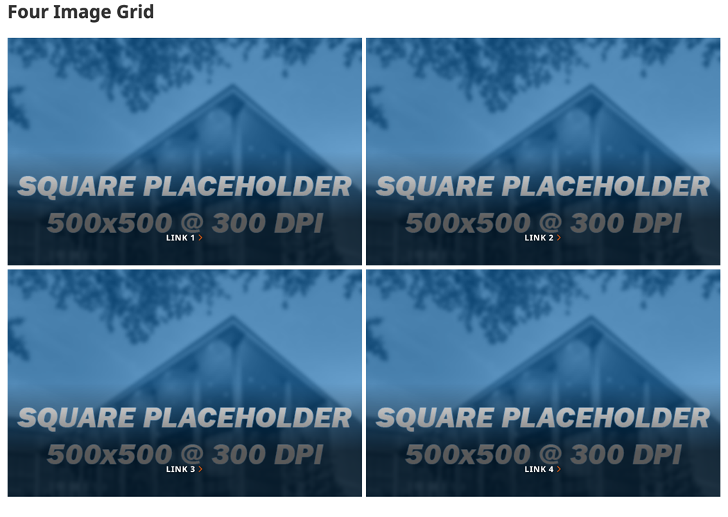
Four Image Grid
The Four Image Grid allows you to place four images with four links on the page.
Sitecore Components
This is a non-exhaustive list of components that you have available to you.
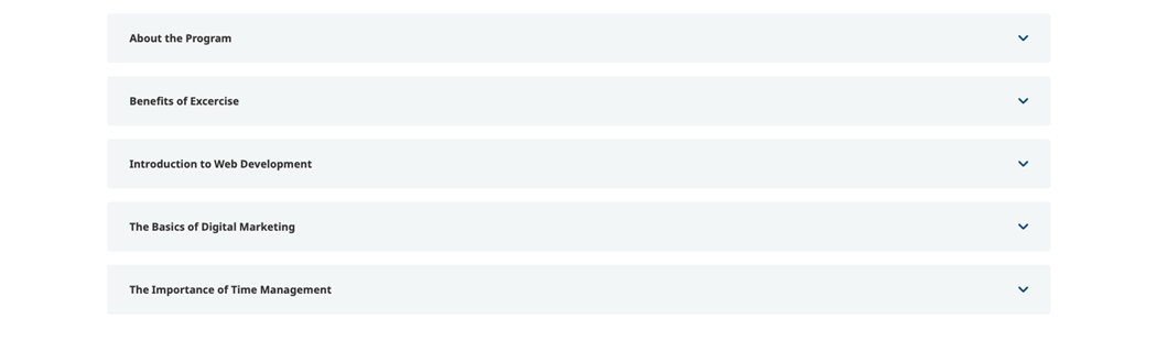
Accordion
The Accordion component allows you to enter a lot of rich text without significantly influencing the page length.
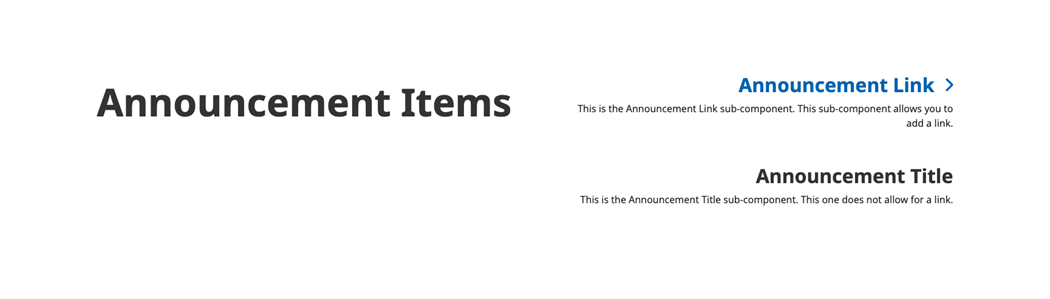
Announcement Items
The Announcement Items component is great for adding multiple prominent notices to your page.
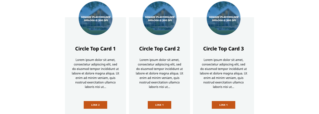
Circle Top Profile Cards
The Circle Top Profile Card is a card with a round image on the top.

Component Subject Carousel
The Component Subject Carousel gives you the ability to create both an image carousel and a select number of components below that carousel.

CTA Accent
The CTA Accent can be used to display short but important information that catches the user's attention.

CTA Billboard
The CTA Billboard is fantastic for a large callout of an upcoming event, or for featuring a key offering that a user may be looking for.

CTA Link List
This component is a great way to add a bunch of links in a very nice way to the main body of a page.
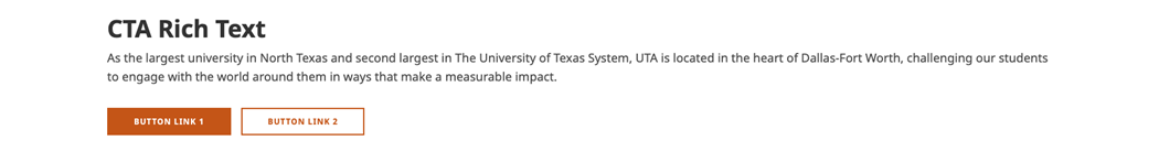
CTA Rich Text
The CTA Rich Text is a super easy way to add a standard CTA with up to 2 links onto the main body of a page.

CTA Right Rail
The CTA Right Rail component allows you to add a simple CTA to any page with a rail component.
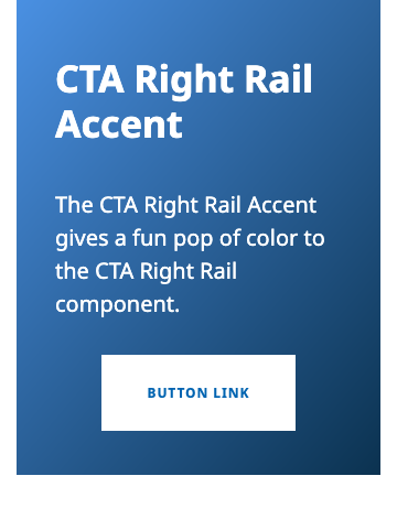
CTA Right Rail Accent
The CTA Right Rail component allows you to add a simple CTA to any page with a rail component.
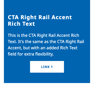
CTA Right Rail Accent Rich Text
The CTA Right Rail Accent Rich Text component is the same as the CTA Right Rail Accent, but with a Rich Text field in the Description.
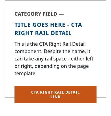
CTA Right Rail Detail
The CTA Right Rail Detail component is the same as the CTA Right Rail component, but with a Rich Text field in the Description.

CTA Right Rail Image
The CTA Right Rail component allows you to add a simple CTA to any page with a rail component.
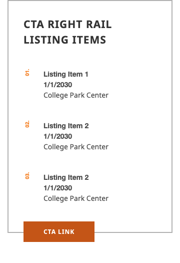
CTA Right Rail Listing
This component is great for listing upcoming events, meetings, seminars, etc. It has fields for date, time, and venue.
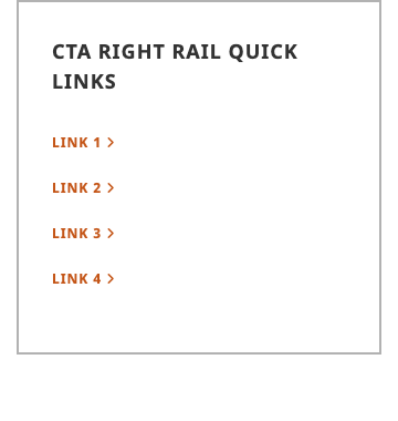
CTA Right Rail Quick Links
The CTA Right Rail Quick Links component is a great way to add important links to a sidebar.
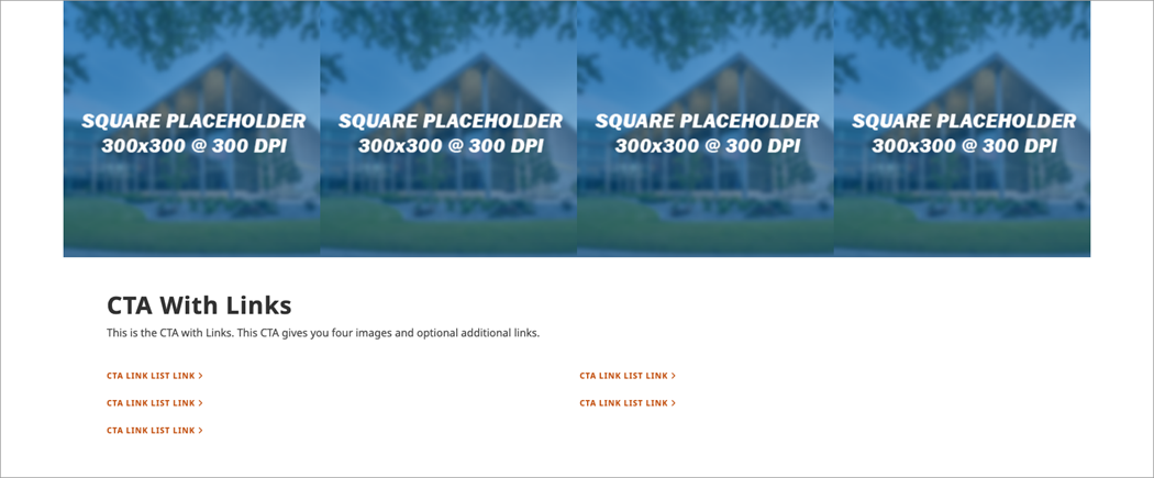
CTA with Links
This CTA gives you four images and optional additional links.

Datapoint Listing
The Datapoint Listings component is the best way to show off rankings and other numerical data.

Event Countdown
The Event Countdown component counts down to a user-specified date and time.

Feature Interest
The Featured Interests component allows you to have up to four images on the same row. All of the images can serve as links, as well as having a title and short description field.

Featured Link List
The Featured Link List component is a component that allows you to add a title and up to seven featured links.

Featured Topic Listing
The Featured Topic Listing content type automatically pulls news stories from a user-specified folder, filters it by a user-specified Topic, and returns those news stories in the form of three cards and two psuedo-right-rail items.
Four Image Grid
The Four Image Grid allows you to place four images with four links on the page.

Gradient Hero
The Gradient Hero is the most basic tool in the Sitecore toolbox.

Hero Compact
This hero is the shortest hero that you can add an image to and have it appear on the site unobstructed.

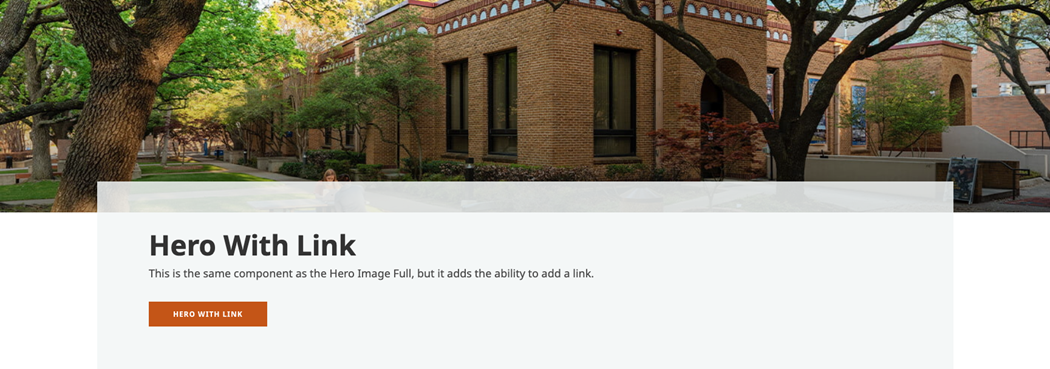
Hero Image Full
This hero is the most-used hero across the site, as it allows you to place a full-height image on a page with a title and description.
Hero Landing
The Hero Landing is the primary hero that is used for landing pages.
Hero Landing with Links
The Hero Landing with Links allows you to place up to three links on a Hero Landing.
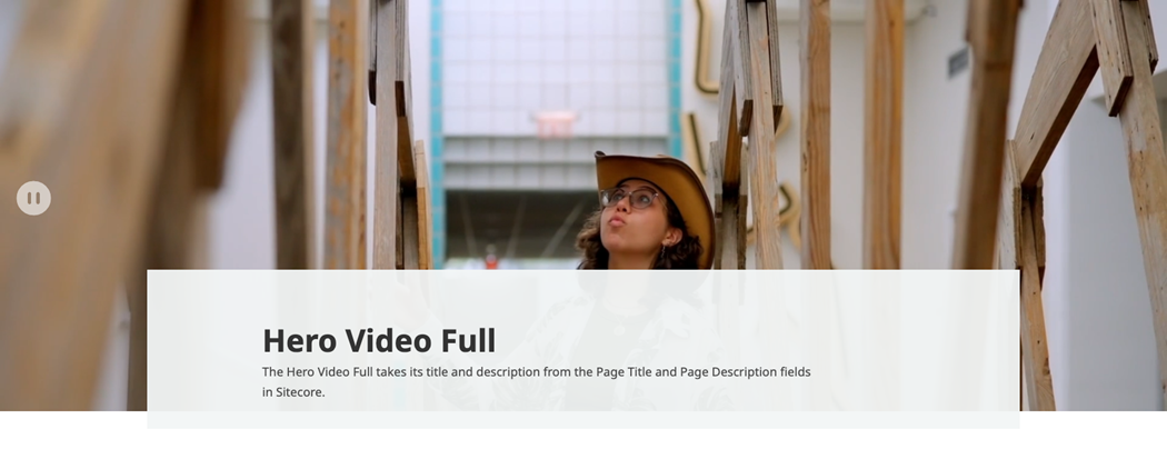
Hero Video Full
The Hero Video full is the only approved way to add a video to a hero section on the page.
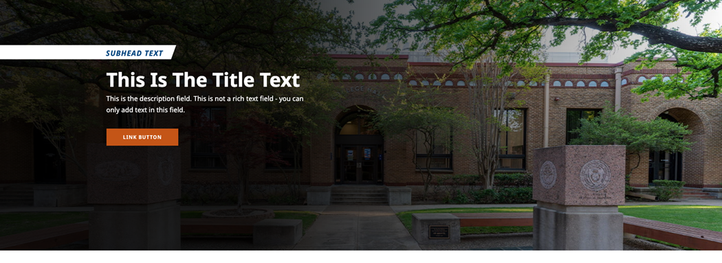
Hero with Link
The Hero with Link is essentially the Hero Compact, but with the ability to add a link.

Hero with Slate
The Hero with Slate component allows you to natively embed a Slate form into the hero of any webpage.
Left Image Vertical Listing
The Left Image Vertical Listing is a great way to add a lot of information to a page efficiently.
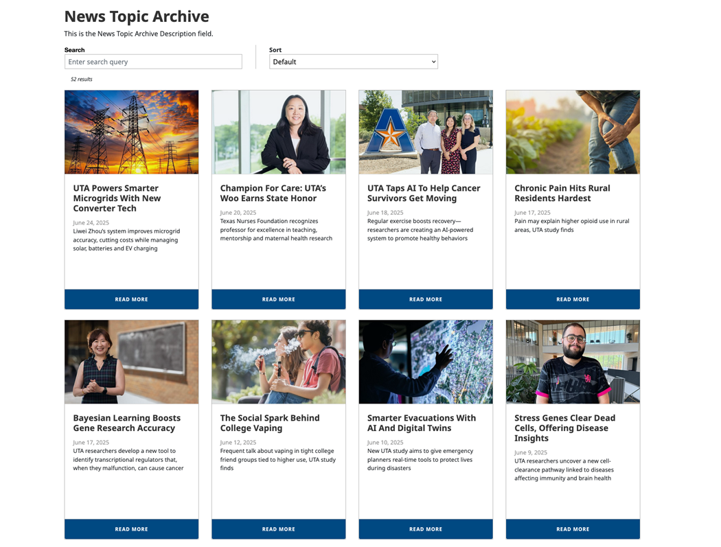
News Topic Archive
The News Topic Archive component returns all of the news articles from a user-specified branch that are tagged with a user-specified Topic.
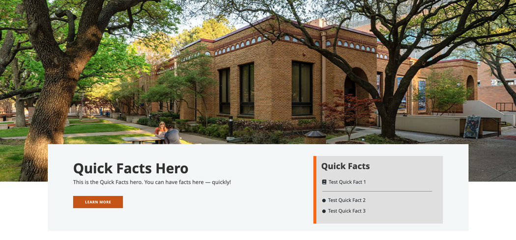
Quick Facts Hero
The Quick Facts hero allows you to have a title (controlled by the Page Title), a description, a CTA, and up to four quick facts.
Right Grid Content Block with Links
The Right Grid Content Block with Links lets you add five links to a page, four of which have images.
Components
Components are building blocks you can assemble to make unique page layouts