502 South Cooper St. #335
Box #19089
Arlington, TX 76019
Award Winning Identity for Agriculture Incubator

Assistant Professor of Visual Communication Design Dr. Ananya Singh won the International Design Honorable Award and an ADDYs Gold Award for a visual identity project that she developed in 2024 together with her team and a mentor, Professor Gauri Misra Deshpande.
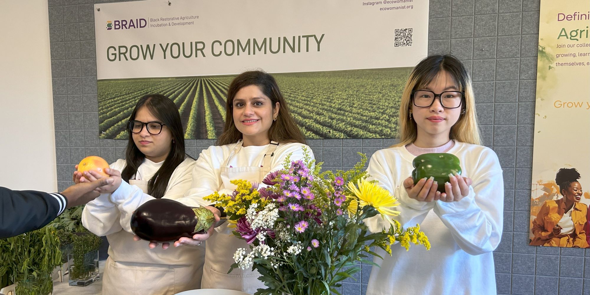
Dr. Singh served as the Research Analyst, working alongside Valerie Hill Rawls who is the co-founder of nonprofit EcoWomanist Institute Southeast (EWISE). EcoWomanist Institute partnered with SCADpro, a collaborative design studio at Savannah College of Art and Design in Atlanta to create a strong visual identity, which could channel and support EWISE’s mission to empower Black female farmers in the southeastern U.S. Their effort led to the creation of BRAID – Black Restorative Agriculture Incubation & Development, a project that provides supportive and uplifting ecosystem for womanist cultivators. Through research, community engagement, and storytelling, the project evolved into a movement addressing land loss and systemic barriers in agriculture.
Dr. Singh shares creative insights about developing the logo and visual identity for BRAID:
“Rooted in community, healing, and growth, the visual identity for BRAID was intentionally designed to reflect the guiding values of the Ecowomanist Institute and the Black Woman Future Farmers Incubator.”
The name BRAID inspired the metaphor of interconnection, threads of heritage, agriculture, womanism, and spiritual ecology coming together. The design team centered the visual language around themes of unity, legacy, and regeneration, capturing both ancestral wisdom and future-forward resilience. The identity speaks to women of all ages and backgrounds, with inclusivity and empowerment at its core.
The brand colors were chosen to evoke both natural and cultural meanings:
-
Earthy Browns represent soil, grounding, and ancestry.
-
Lush Greens signal renewal, life, and sustainability.
-
Radiant Yellow stands for hope, warmth, vitality, and transformation—a color that invites both energy and optimism into the farming narrative.
The yellow flower seen in the logo is a sunflower, a symbol of nourishment, resilience, and sunlight. It represents not just beauty and strength, but also the connection to nature, growth, and feminine energy. Positioned alongside a woman standing in a field, the flower reinforces BRAID’s vision of cultivating both the land and the self.